


 Tutorials
 9.14.2023
Swatch This by Haruyoshi Nagumo is one of the most coveted books by the Connecting Threads staff; it’s colorful, beautiful, bright and full of possibility. However, you might be looking at it and wondering, “How do I actually use this book?”
Color can be intimidating, I get it! Faced with a world of options, how do you whittle down a massive stack of fabrics down to 4? How do you make sure those 4 fabrics will blend smoothly, creating an eye-catching final quilt? Where do you even start?
Enter: Swatch This!
If you’re new to color theory, start at the introduction; it’s a simple beginner’s guide to the basics of color. You’ll learn about types of color schemes, designing high or low contrast palettes, the history of your favorite colors, and much more!
If you’re ready to sink your teeth into creating custom color palettes, let’s dive into why I love Swatch This so much:

This book works best when you pick a color to start building off of; for this example, we’re going to pick Azure (91223) from our Color Wheel Solids collection.
Every section of the book centers around one main color, including Neons and Metallics. Azure is a type of Blue, so I started by flipping to the Blue section.
On the left, you can see 2 of the main introductory pages for the color Blue. There are historical notes, natural examples and even how the color works with human psychology!
Each color is filtered down into 8 types of color palettes: Emphasis, Similar Color, Secondary, Contrast, Movement, Image, Multiple Colors and Japanese Style. Let’s break those down using Azure:

Emphasis, which focuses on Prominent Uses of the color, creates palettes that truly push Blue to the forefront. In the top right-hand corner, you get a breakdown of the colors chosen in this particular style of palette: Blue is the largest swatch, and the smaller swatches represent options to pair with the main color. Next, there are simple Three-color Combinations using those paired swatches. The magic of this book, however, is what comes beneath the Three-color Combinations!
Haruyoshi Nagumo uses an array of illustrations to demonstrate how these color palettes might look in varying situations. Contemplating on how blue, grey and green look in a geometric-style block? Or maybe you want a botanical pattern with leaves and florals? These simple color illustrations give you a more concrete idea of how your fabrics will play in an actual quilt. They’re my new favorite launching pad for palettes: I pick my base color, find the style of palette I want and then pick my favorite color combination. From there, I can choose my accompanying fabrics and start designing!
For my Emphasis palette, I chose Silver (91182) and Forest (91213). I love how the lighter Silver helps emphasize the vibrancy of the Azure, while the darker Forest doesn’t compete with that vibrancy.
Now, let’s go through the next 7 styles of palettes to see what I chose for each one!
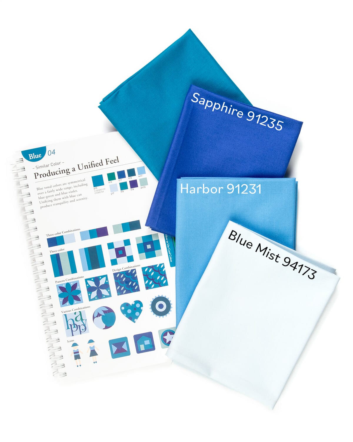
Similar Color, which centers on Producing a Unified Feel, creates palettes that let Blue fall into a monotonous cadence. These colors will look similar, with slight variances in hue, but when combined together, they create a stunning sense of serenity.
For my color palette, I choose Sapphire (91235), Harbor (91231) and Blue Mist (94173). A marriage of blues, this selection is definitely for true lovers of the shade!
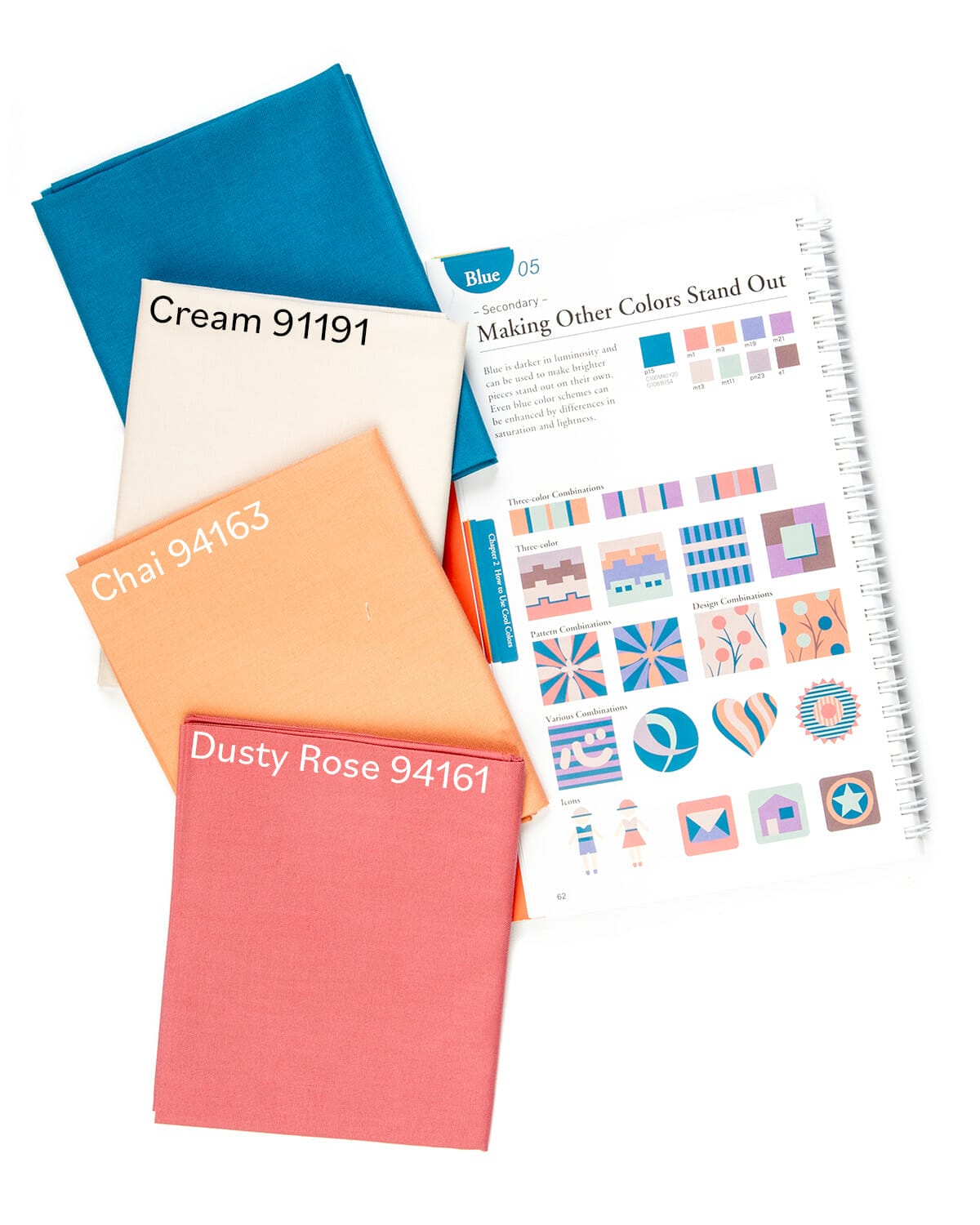
Secondary is all about Making Other Colors Stand Out. Try using this page when you’re building a palette around a background shade, like cream or navy. For quilting, think of the fabrics you have 2-3 yards of lying around, maybe from a project that never got off the ground! Flip to that color, find the secondary page, and start building out your new color scheme.
My chosen Azure shade is one of the darkest on this page, which gives lighter colors a chance to shine. I’ve paired it with Cream (91191), Chai (94163) and Dusty Rose (94161).

Contrast is exactly as it sounds: Producing Accents using contrasting shades. Think of vibrant colors paired with complementary shades! Bold and exciting! Bright lights and deep darks!
This scheme consists of Orange (91201) and Scarlet (91194).
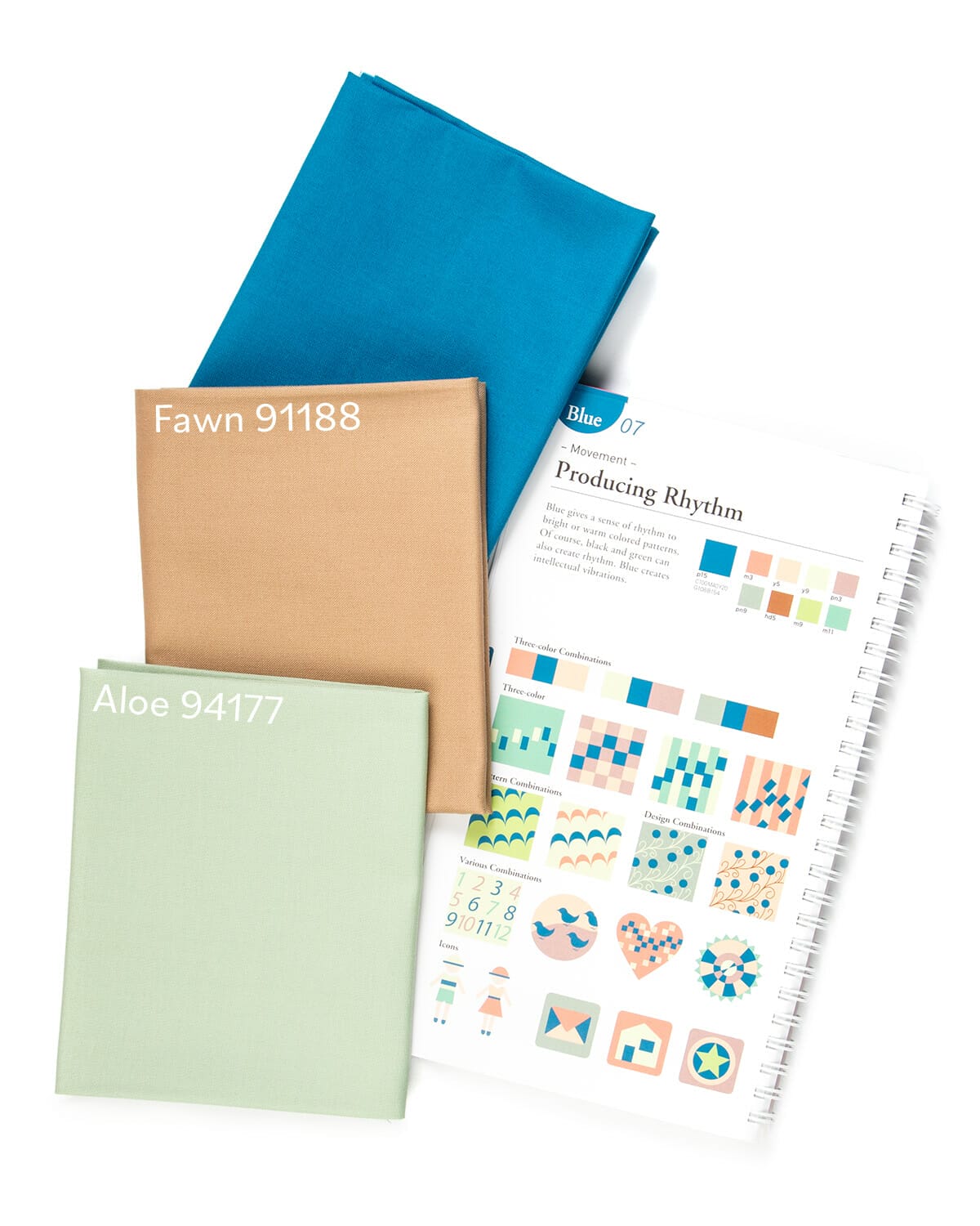
Movement is meant to Produce Rhythm, creating a soft swing between warm and cool tones. This color scheme has definitely become a favorite of mine, with exciting and unique color combinations that feel bold, yet oddly natural. It’s one of the toughest sections to define, yet you know it when you see it!
For my Movement palette, I pulled in Fawn (91188) and Aloe (94177) to create a soft dance between cool and warm.
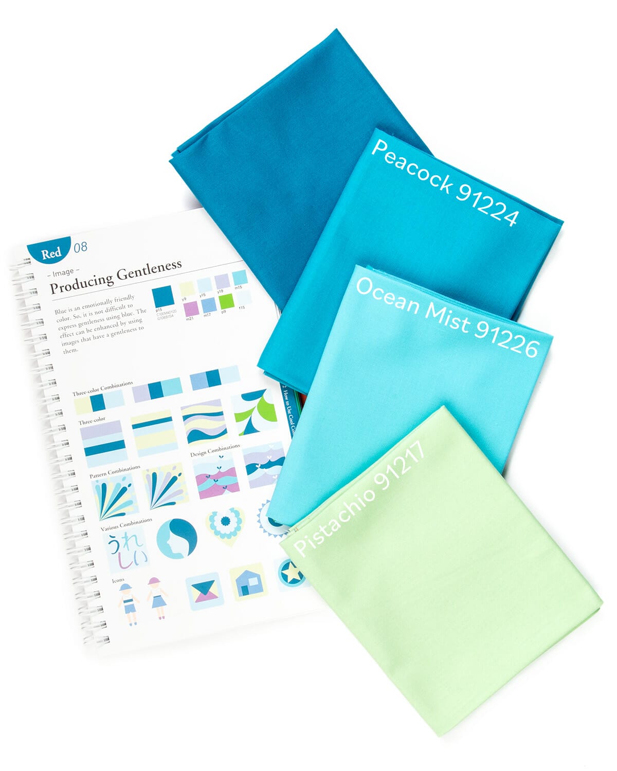
Image is all about Producing Gentleness, allowing color psychology to soothe the soul. Blue has the gift of naturally being a more calm color, so promoting tranquility with a lineup of varying hues is a breeze!
This gentle color scheme utilizes Peacock (91224), Ocean Mist (91226) and Pistachio (91217).
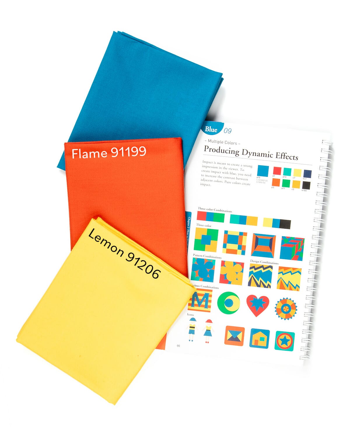
Multiple Colors focuses on Producing Dynamic Effects, using a wider arrangement of hues to create a stronger impact. This will be the closest scheme to a full rainbow color array, with warms that transition directly into cools.
This scheme uses Flame (91199) and Lemon (91206) for a bold and exciting trio!
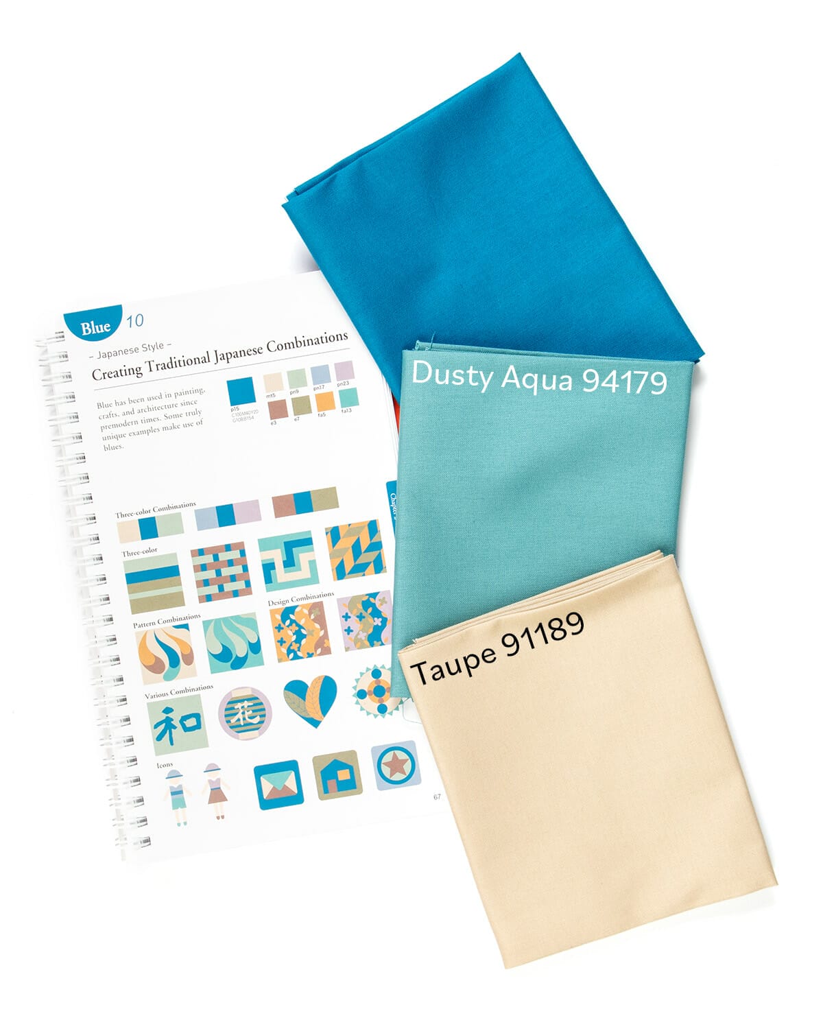
Japanese Style is the most unique of the bunch, Creating Traditional Japanese Combinations. Nagumo uses Japan’s rich history of color to promote palettes that evoke traditional art forms.
This last combination uses Dusty Aqua (94179) and Taupe (91189), one of my absolute favorites for Azure.
My parting note about this book: use it as a loose guide, a starting out point for your fabric palette. Let’s use the last Japanese color scheme as an example:

Sorting through the stash of fabrics at Connecting Threads’ sewing room (yes, it’s as fantastic as you think it is!), I spotted Lady Montague II, the main floral from Belles Fleurs. It shows off exact or very similar colors to my trio. The background of cream and swirls of gold can lean towards taupe, like this geometric print Staggered. The leaves are a perfect match for Faux Linen in Dusty Aqua, which I translated directly from the original color palette. Last is Azure in Faux Linen; while it might not match perfectly, it’s a bolder hue than the teal flowers, giving the whole color scheme a punch of vibrancy.
I know that creating color palettes can seem intimidating, but Swatch This does a wonderful job of helping you through the process. Have a floral brocade like Lady Montague II that you want to build off of? Pick a base color (like teal!) and see how Swatch This pairs it! Have a wedding quilt to make for a couple that prefers neutrals? Start off with a neutral base and then build up!
The possibilities are endless and we can’t wait to see what you create!
Happy sewing!

